A Cavalcade of Covers
Ramona
Posted 19 Aug 2018
Last time’s dive into Wrinkle of Time was too much fun, so I had to do it again. For whatever reason, Ramona doesn’t seem to have had its covers reinterpreted as much as Wrinkle, but there are still quite a few, as usual spanning a range of good, bad, and indifferent.
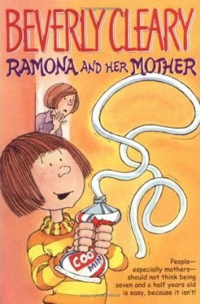
These cartoony editions were quite popular for a while. I’ve never liked them. There’s a certain energy to the linework, but those beady little eyes give me the creeps. Unfortunately I’m not sure who the artist is. 3/10
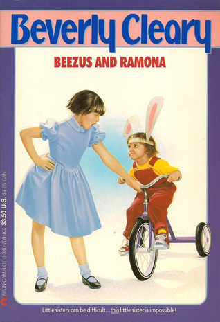
Hoo boy but these airbrushed “photoreal” covers were popular in the 90s. (The Boxcar Children books all had them, too.) Most of my Beverly Cleary books were from this edition. I guess it must have been a real golden age for these artists, but it strikes me as pretty uninteresting now. And what is Beezus wearing? It’s not Easter, despite Ramona’s bunny ears. 5/10
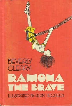
I also had this cover growing up (it was from my mom’s childhood collection). And I must say, I kind of love it! It’s such a great drawing (by Alan Tiegreen), perfectly capturing the spirit of the book despite the fact that it doesn’t depict any particular scene. That orange background is incredibly eye-catching. And that type! I don’t know what’s going on with that type, but it’s great! 10/10
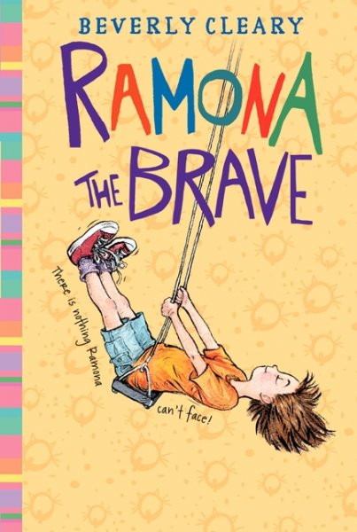
Wait a minute, why does this look so familiar? I don’t want to blame Jacqueline Rogers for this clear ripoff, so I’m going to assume that her art editor put her up to it. Rogers’s drawing is good (I particularly like the quality of the linework) but the cover overall is a very poor imitation of the Tiegreen one. That eye-smashing orange background has been mollified, the composition is far less dynamic, and the type is bland. And with all due respect to Ms. Rogers, the image seems to suggest “Ramona balancing on a swing that isn’t moving” moreso than “Ramona is swinging as high as she possibly can.” One point for draftsmanship, for a total of: 1/10
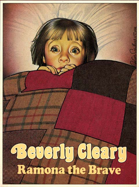
This is from the Beverly Cleary editions with covers by Joanne Scribner, who I didn’t know much about before today, but I’m going to have to seek her out more. She’s clearly drawing a lot of influence from the great magazine illustrators of the past (Rockwell, Leyendecker, etc), but the overall effect is unique to her. In this particular cover I like that she has chosen to cultivate a dramatic irony by putting a picture of Ramona looking terrified with the title Ramona the Brave. 10/10
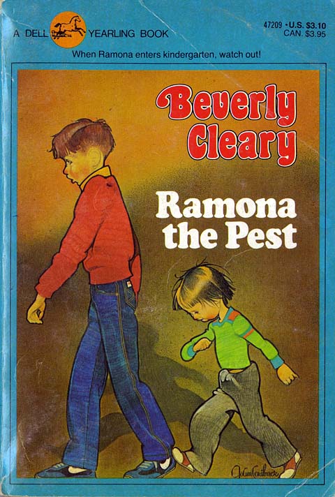
Scribner again. Those thick black outlines make it look kind of like stained glass. It’s fun to have Ramona harassing Henry instead of Beezus. 8/10
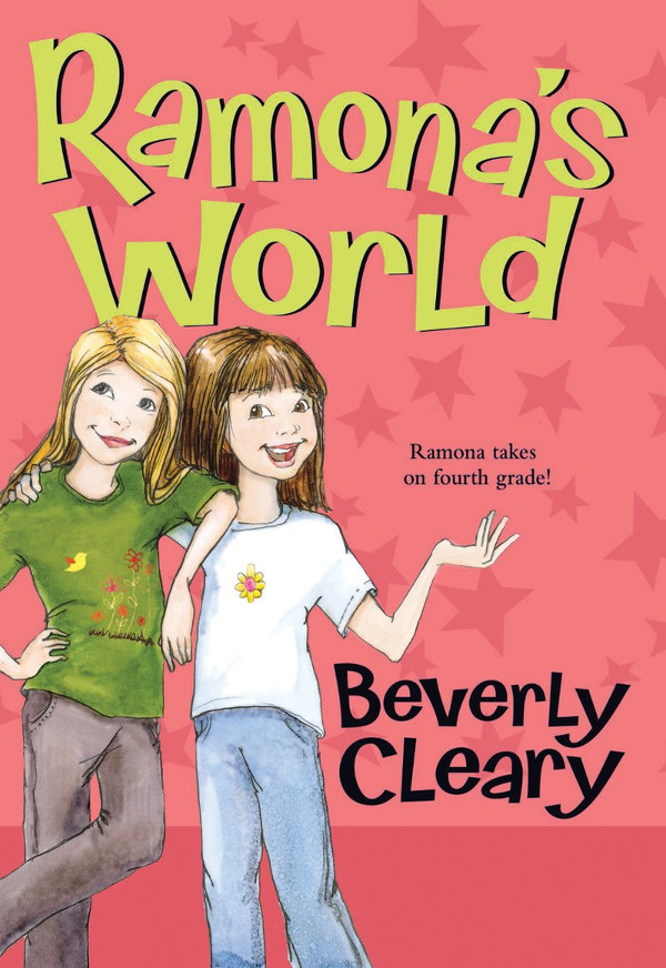
Another recent reissue, and boy do I hate it. The faces remind me of those hideous Bratz dolls (are those still around?) and the characters aren’t doing anything. Ramona is always doing something, that’s the whole point of these books. This is like advertising an Indiana Jones movie with a picture of him standing at the front of his classroom. And that type is stupid. And that tagline… if you didn’t know anything about this Ramona character, there’s no way it would make you want to find out more. Ugh, let’s… let’s just move on. 0/10
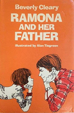
More Alan Tiegreen, but I don’t like this one as much. What is she doing, having a staring contest? (To be fair, maybe she actually does that in the book, I can’t remember.) And the composition can only be described as boring. 4/10
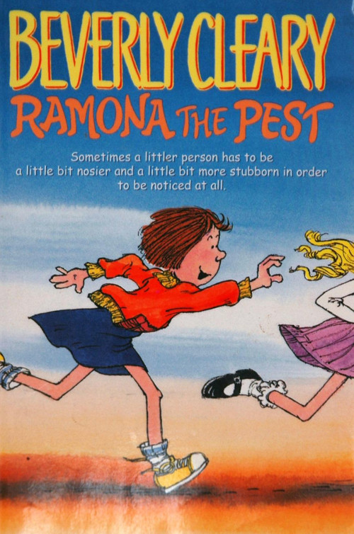
Here’s another of those beady-eyed ones. This one I like better though. There’s a lot of energy in it. 6/10
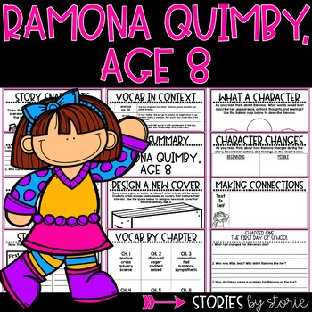
Finally, here’s some sort of school curriculum for use with the book. Agh! The colors! My eyes!!! I notice one of the assignments is “Design a New Cover.” Get to work quick, kids! It’s an emergency!