A Cavalcade of Covers
A Wrinkle in Time
Posted 05 Apr 2018
While working on my review, I couldn’t help but notice that A Wrinkle in Time has had a bajillion different covers, of varying degrees of quality. Unfortunately I have no information about the artists behind most of these covers, but let’s take a look anyway!
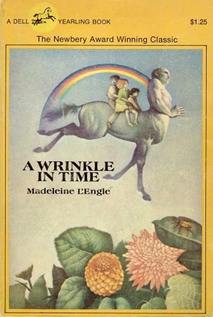
Well isn’t this a delightful bit of van art! We’ve got Mrs. Whatsit as the centaur, the kids, an alien landscape, and some sort of misplaced line of emphasis under the word “in.” I give it a 6/10.
This was a very common edition when I was a kid. It was painted by Peter Sis, a peculiar Czech illustrator who produced some very strange children’s picture books. It’s an interesting image, although I’m not sure it really represents the book all that well. 5/10. Sorry Peter!
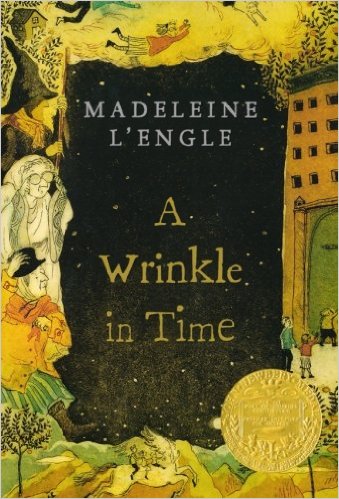
This is probably my personal favorite, and another that I’ve seen frequently over the years. The composition is quite striking, especially with that big field of blackness in the background, and it includes not only Meg, Calvin, and Charles Wallace, but also the three Mrs. Ws, The Black Thing, and even the Happy Medium! It’s a wonderful image that also encapsulates the book beautifully. It was painted by Leo and Diane Dillon, a husband-and-wife illustration team which I really ought to be more familiar with. 10/10.
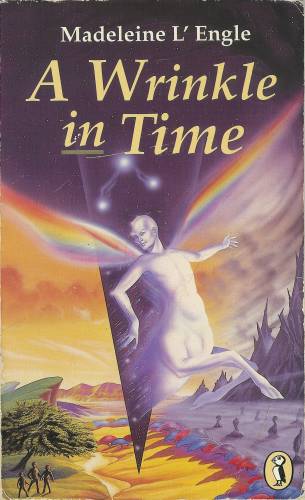
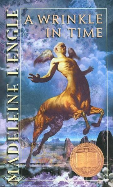
Agh! What is this? How do those wings connect? What’s with the murky colors? Why is the centaur making a pouty face? Why are they flying over Camazotz, which is from an entirely different part of the book? Who greenlit this thing? 1/10.
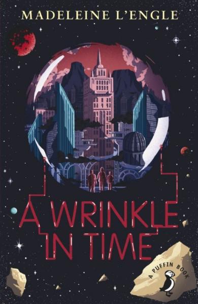
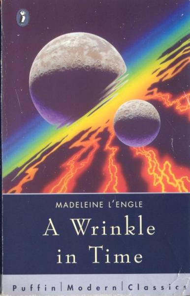
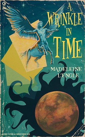
A very up-to-date style on this one. Not the most lively cover so far, but the colors are pretty nice and it has a good, balanced look overall. 7/10.
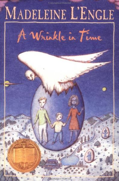
This is the edition I had, illustrated by Cliff Nielsen. I quite liked it as a kid, but now this kind of digital compositing strikes me as quite dated and silly-looking. Is that a Bryce 3D landscape I spot below the centaur? 5/10.
This one is kind of interesting. The cartoony approach strikes me as not quite appropriate for the story, but it’s nice in its own right. 6/10.
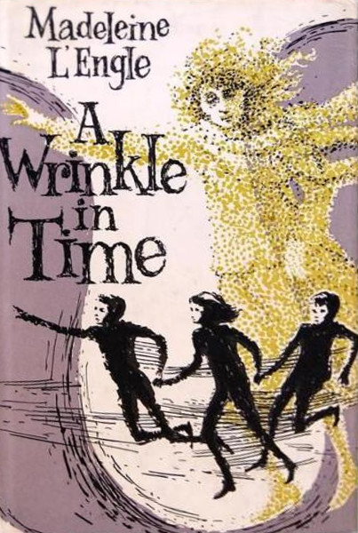
This is a good one, if a bit old-fashioned. Very nice complementary palette going on, and I like that pointillist approach. Bonus points for hand-drawn typography! 8/10.
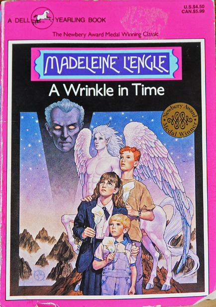
Well this one is really something. If you can get past the hot pink frame you’re treated to some realistic but very stiff-looking kids, and Meg is wearing what appears to be a schoolgirl uniform for some reason. The centaur is here again, with a face like a Peter Jackson elf and some sort of puppy-dog-eyes expression. And hanging above it all, the malevolent face of Peter Cushing. It’s dreadful, but so wonderful! 8/10.
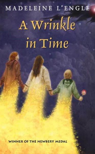
We don’t need no stinkin’ characters! 4/10.
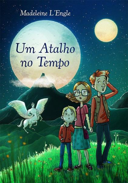
Style seems a bit more appropriate for a picture book, but there’s still something very charming about this Portuguese edition. 7/10.
Cover artists can’t resist the centaur scene, can they? This is probably the blandest interpretation possible. 2/10.
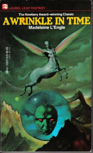
The man with red eyes makes a delightfully creepy appearance on this one, but of course the centaur has to photobomb him. 5/10.
Wrinkle back to the fabulous fifties with this wacky interpretation! Goofy as it is, I kind of love it. 8/10.
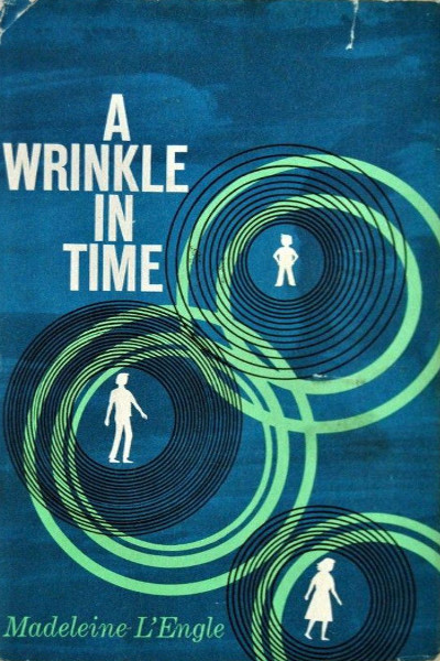
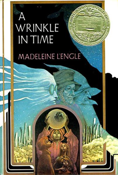
This is the first edition if I’m not mistaken. A pretty typical style for the era, but quite nice, a kind of Saul Bass sensibility. 6/10.
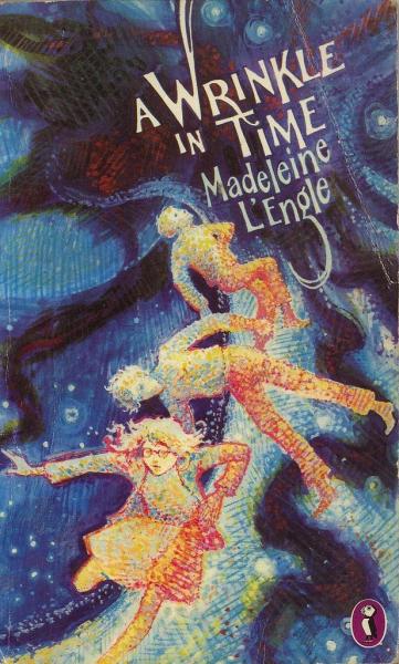
My goodness, what on earth is supposed to be going on here? I guess that’s The Black Thing in the corner, but why are the kids turning into stardust? Also, whoever is responsible for this horrible mishmash of typefaces should be ashamed. 1/10.
Some very nice energy in this one, especially given the limited color palette. The hand-drawn typography is particularly great…I wouldn’t mind a cover with just that and nothing else, come to think of it. I can’t tell which person is supposed to be Calvin and which is Charles Wallace, though, and since one is a teenager and one is little more than a toddler, that’s kind of odd. 7/10.
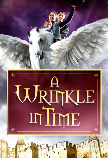
Finally, here’s the poster for Disney’s made-for-TV adaptation from 2003! As you can see, it’s a story about some bland-looking kids who ride Pegasus back to the Middle Ages! ???/10.