A Cavalcade of Covers
Charlie and the Chocolate Factory
Posted 12 May 2019
Like any book that’s been in print for decades, Charlie and the Chocolate Factory has seen a large number of cover designs come and go. Let’s dive in!
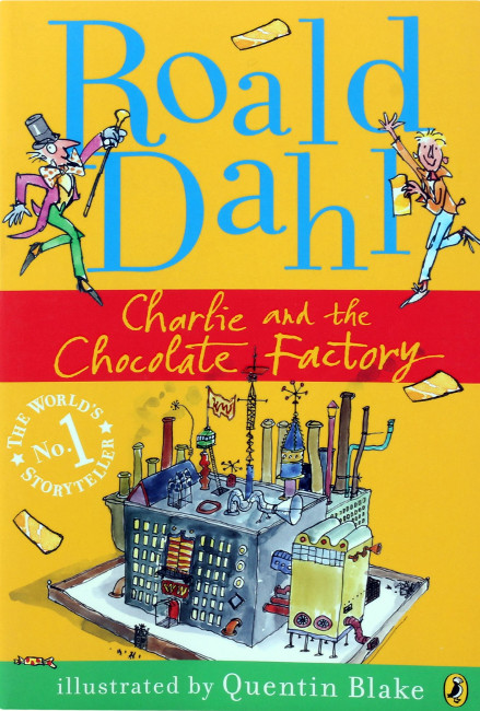
No discussion of Roald Dahl is complete without touching on his frequent co-conspirator, Mr. Quentin Blake. Exactly how Blake became so closely tied to Dahl I’m not sure, but he has at this point produced illustrations for most (if not all) Dahl’s children’s books, and these editions are by far the most common. And, not to put too fine a point on it, I don’t like them. As a kid I didn’t have much respect for Blake’s drawings, as I thought they looked like they’d been dashed off in an hour. As an adult I have a bit more respect than I used to, knowing as I do now that this kind of effortless look is actually fairly difficult to pull off, but I still don’t think these are that great. Charlie has had a few different Blake covers at this point, but I selected this one because I think it highlights the main weakness of Blake’s approach: his designs tend to be kind of bland. Aside from the chimneys, Blake’s factory design is just a big gray block with windows on it, and even the chimneys would barely register a 2 on the Whimsy Scale (where Dr. Seuss is a 10).
*Seriously, what?
Blake’s illustrious career has afforded him with opportunities to draw for the likes of William Steig, Dr. Seuss, and Sylvia Plath*, and afforded him an actual knighthood, but I guess I’ll never be a fan.
Rating: 3/10
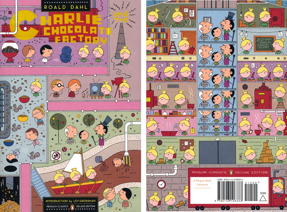
Nowadays it’s become common for prominent cartoonists to be called upon as illustrators, a trend which I naturally approve of. Still, it’s a bit strange for me to see this artist, Ivan Brunetti, illustrating a children’s book, as he came to prominence drawing some of the most obscene, violent doodles the form has ever seen. (Seriously, he’s drawn some cartoons that would give pause to R. Crumb. Crumb would still draw them, of course, but he’d pause.)
But all that aside, this is pretty great! For a book that has a number of vastly different scenes, Brunetti’s is the only cover I’ve found that depicts more than one of them. The fates of all four of the Bad Children are on the front cover, and the back cover includes a large variety of Oompa-Loompa busywork, including, apparently, data entry. The bright colors seem well-suited to a book about candy, too.
Now if only Brunetti would illustrate Sylvia Plath!
Rating: 8/10
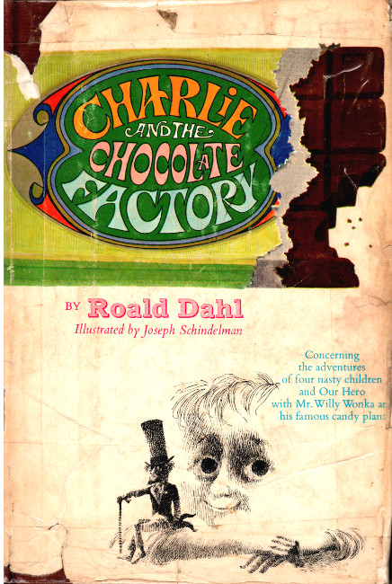
This is the original cover, and coincidentally also the cover I grew up with. I absolutely love Schindelman’s illustrations and I wish his career had been more prominent. Charlie is pretty much the only thing he’s known for, and that’s a shame. His tight, nervous crosshatching is an increasingly rare skill, and I’m particularly impressed by the fact that he renders form with value alone, never with outlines. He died only last year, at the age of 95.
But as for the cover, it’s all right but I don’t love it. The big candy bar title is a nice touch, but I’m puzzled by what the image of a tiny Wonka sitting on Charlie’s arm is meant to convey.
Rating: 5/10
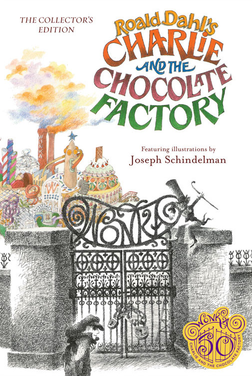
Here’s an alternate Schindelman cover, and I like this one a lot better. Note that his factory is not rendered as a large colorless block. And just look at those delightful hand-drawn letterforms!
Rating: 9/10
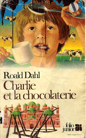
Here’s a strange French edition that appears to be channeling Magritte. And possibly also MC Escher… I’m getting very confused by how those pipes connect to the factory. Interpreting the factory as some sort of Renaissance-era palace is an interesting touch, too. I would be curious to know why Charlie has two separate hair colors, though.
Rating: 8/10
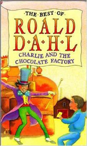
Unfortunately I couldn’t find a better scan of this particular bit of unbridled lunacy. Wonka looks dangerously unhinged (accurate!) and Charlie appears to be doing some sort of shuffle-dance in his pajamas.
On a side note, it’s interesting that Wonka is invariably depicted as skinny, despite the fact that he presumably eats a lot of candy.
Rating:4/10
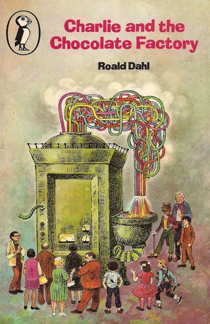
This one is far-out, man. Psychedelic imagery is honestly pretty appropriate for this book, though. I’m more or less certain that somewhere in the Great Glass Elevator there’s a button labeled LSD Lollies.
Rating:7/10
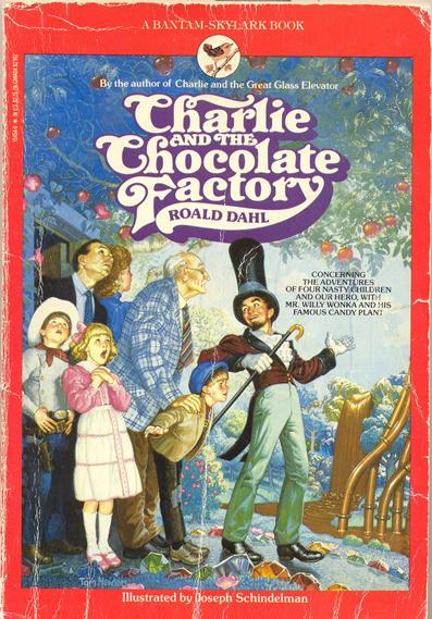
We’re back in the photorealistic covers of the late 80s / early 90s! Oh joy! For such a surreal story this approach feels even less appropriate than usual, although I do kind of like the character designs. Wonka’s outfit is whimsical without appearing totally impractical or absurd, and Grandpa Joe does have the look of someone who’s dangerously infirm. I’m also amused by the expression of religious transcendence by Veruca.
Rating:7/10
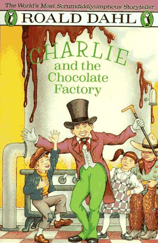
“I guess we’ve all learned a very important lesson today!” “You said it, Mr. Wonka!” (Applause, laughter. End-of-episode musical cue plays. Freeze frame.) Charlie and the Chocolate Factory was performed in front of a live studio audience.
Rating:4/10
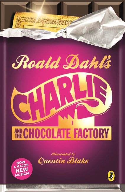
Here’s the tie-in edition for what appears to be a Broadway musical based on the book. I cast some aspersion on it for being so dull, but I do think it’s worth pointing out that the concept of a Golden Ticket is so iconic that all you have to do is depict that and everyone immediately will recognize the story.
Rating:2/10
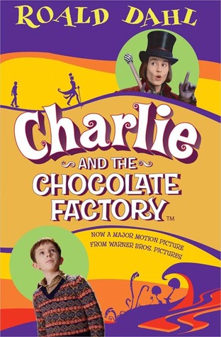
And while we’re on the subject of tie-ins, let’s very briefly look at the edition published to go along with the Tim Burton adaptation from a few years ago. That’s long enough, keep going.
Rating:0/10
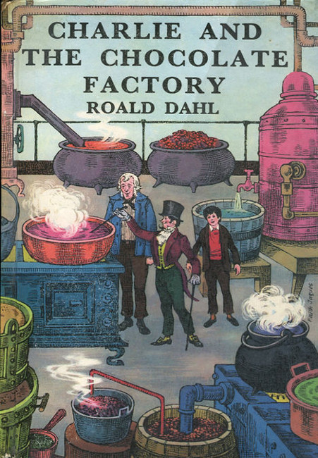
In this version of the story, Charlie and Grandpa Joe are the only ones who got invited to tour the factory. Also, Grandpa Joe is apparently escaped from Dickensian London. This whole thing has a bizarrely Victorian aesthetic for a book that was published in 1964.
Rating:3/10
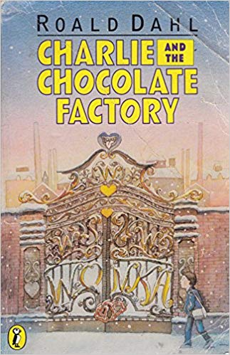
I really like this one, and I wish I could have found a better scan of it. It really beautifully captures the atmosphere of loneliness mixed with curious anticipation that the first third of the book cultivates.
Rating:9/10
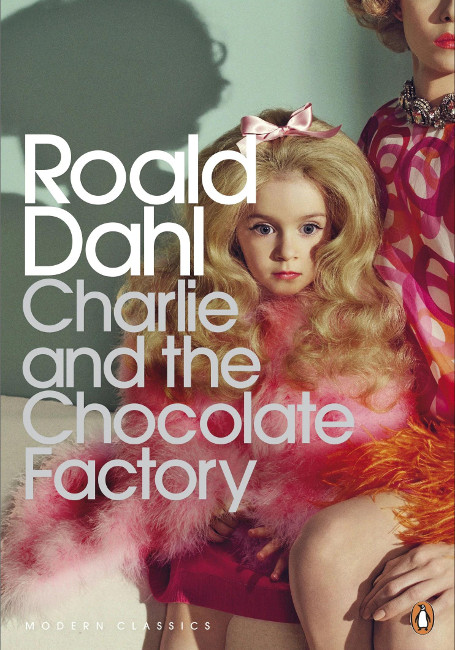
Well, this is a thing that actually happened. I’m not sure whether this ever actually made it to the presses, but it did manage to stir up significant controversy back when it was announced in 2014. Critics understandably called it “creepy” and “inappropriately sexualized.” Penguin Books said that the image was meant to represent “the ‘twisted’ parent-child relationships depicted throughout the book.” OK, if you say so, guys.
Side note, I take issue with the critics who said this cover was suited for Lolita. Certainly there are a lot of Lolita covers that look much like this, but the whole point of that book is that an adult man is manipulating a young girl to capitulate to his desires. I would argue that such covers are inappropriate to Lolita as well, as they distort the book’s central tragedy by presenting Lolita as a sex object rather than a victim.
Rating: 0/10
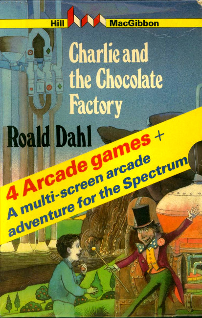
Charlie, I would strongly discourage you from getting any closer to that deranged leprechaun. I know the promise of 4 Arcade Games and a Multi-Screen Arcade Adventure for the Spectrum is a compelling one, but this is clearly not going to end well.
Also, you people have the tiniest hands I’ve ever seen.
Rating: 2/10