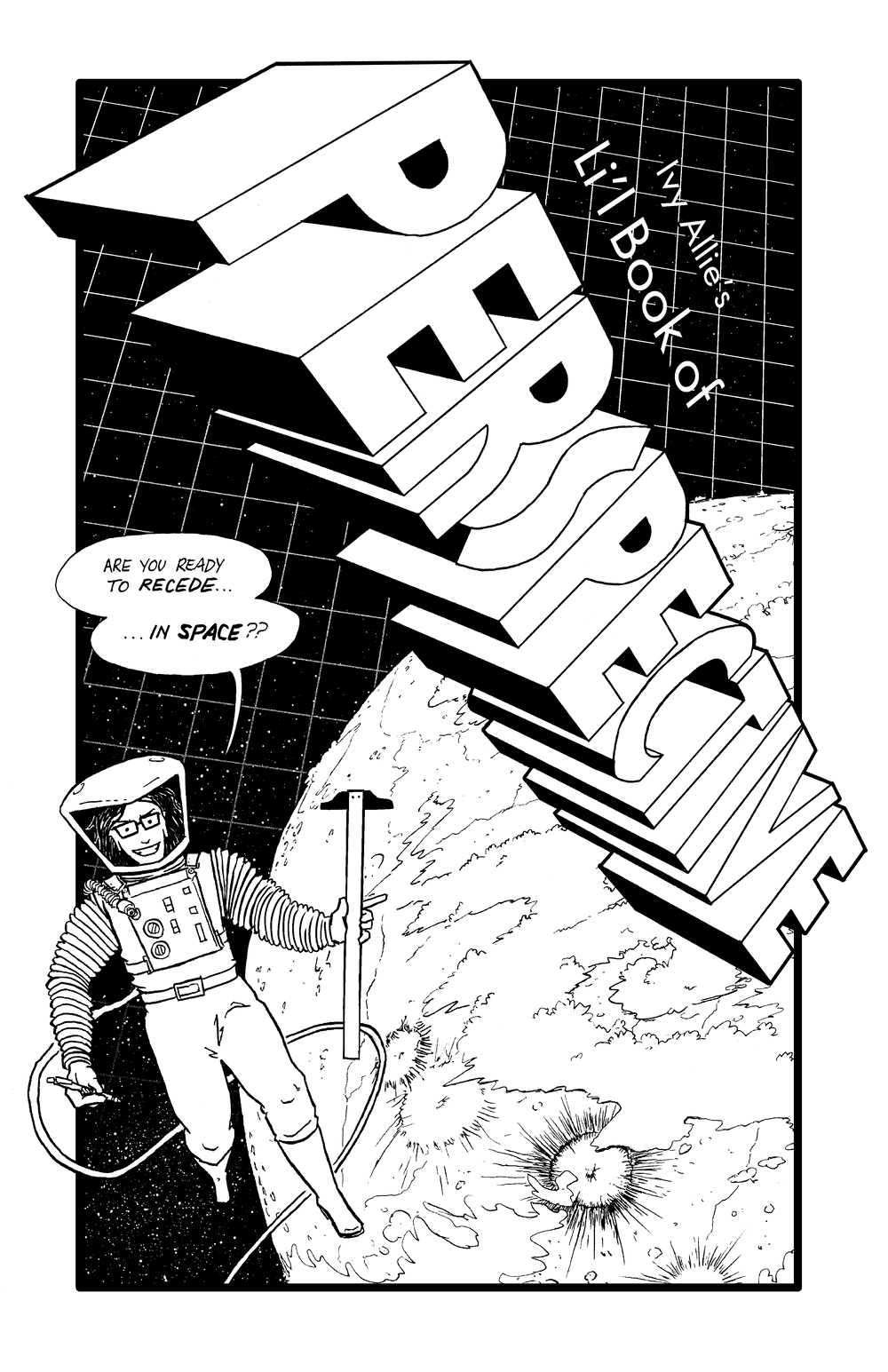
Li'l Book of Perspective
Welcome to Ivy Allie's Li'l Book of Perspective! Whether you're new to perspective drawing and looking for a simple introduction, or you're experienced with perspective and in need of a convenient reference guide, let this be your one-stop shop for perspective techniques!
For your convenience, the entire text of the guide is provided on this webpage, but you can get it in a nicer layout by downloading a PDF version. Choose from a basic PDF, or as a PDF formatted for booklet printing!
This project is distributed under a non-copyright license, so it can be redistributed for any non-commercial purposes. See the indicia for more information.
Table of Contents
- The Horizon Line
- Single-Point Perspective
- Two-Point Perspective
- Three-Point Perspective
- Ellipses
- Placing Your Vanishing Points
- Vanishing Points Beyond the Edge of the Page
- Creating a Perspective Grid
- Dividing Space
- Multiplying Space
- Orthographic Drawing
- Faking It
- Two Last Things
- Exercises
- Further Reading
- Indicia
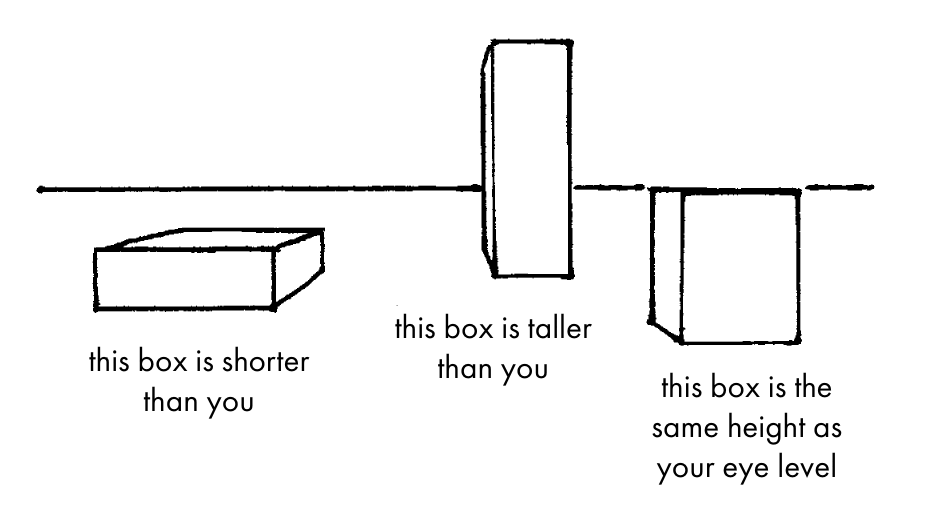
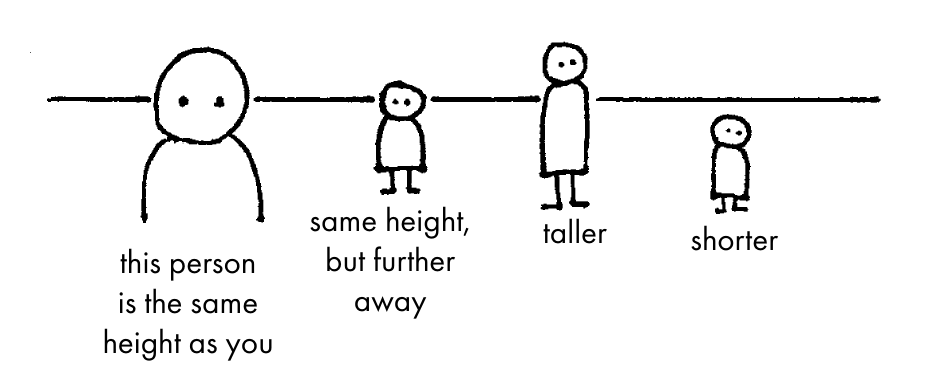
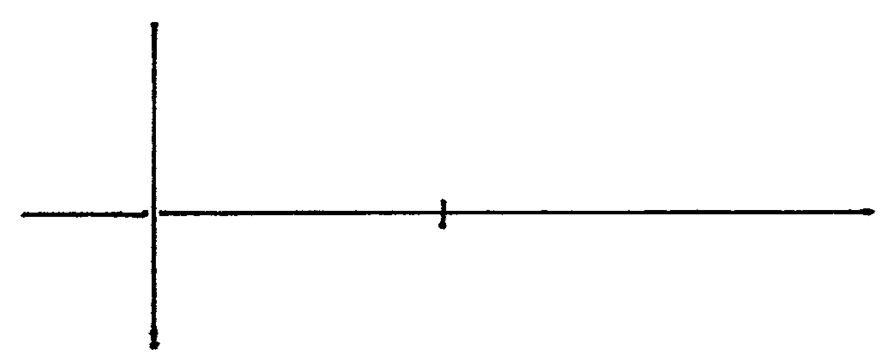
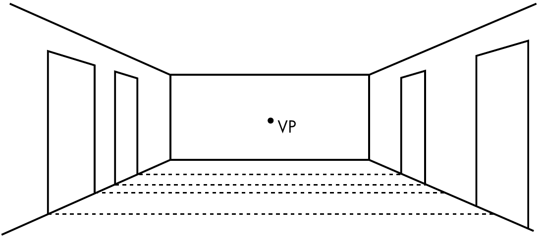
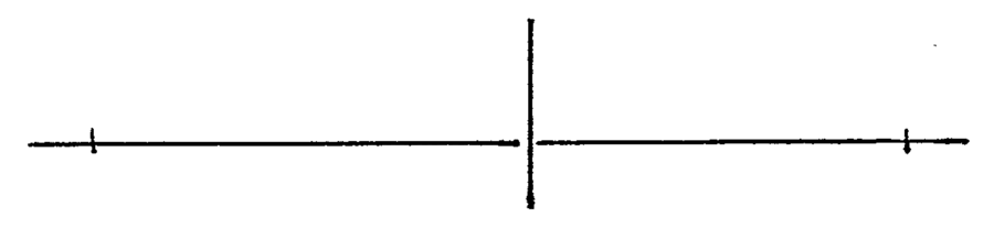
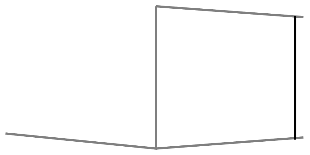
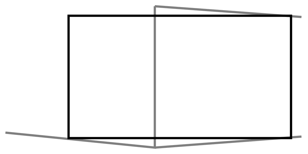
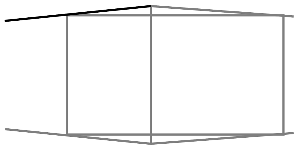
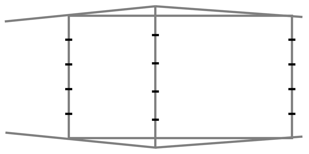
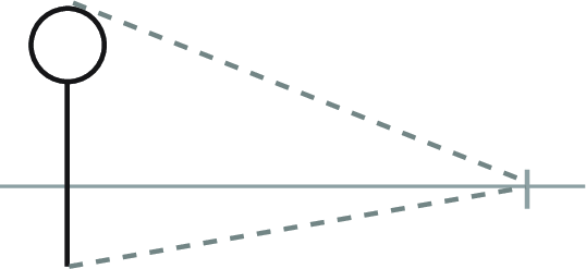
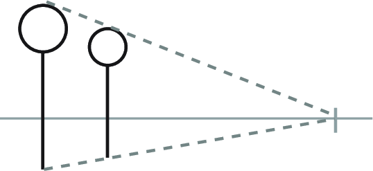
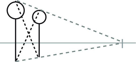
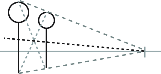
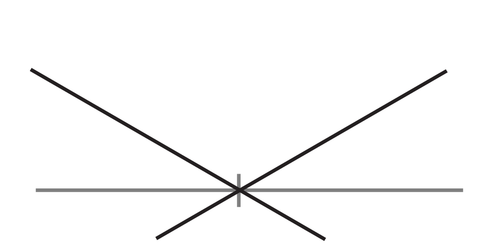
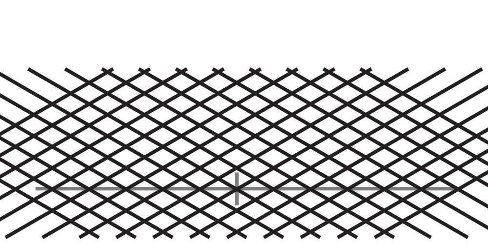
The Horizon Line
Let's begin with the humblest of all drawing elements: the horizon line.

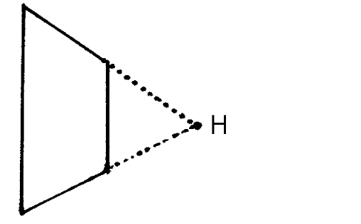
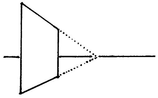
If this happens, all you can do is pick one of them, then correct the nonconforming lines. Remember: lines converge toward the horizon! There are exceptions to this which will be covered later on, but it's still the most important principle of perspective drawing.
Single-Point Perspective

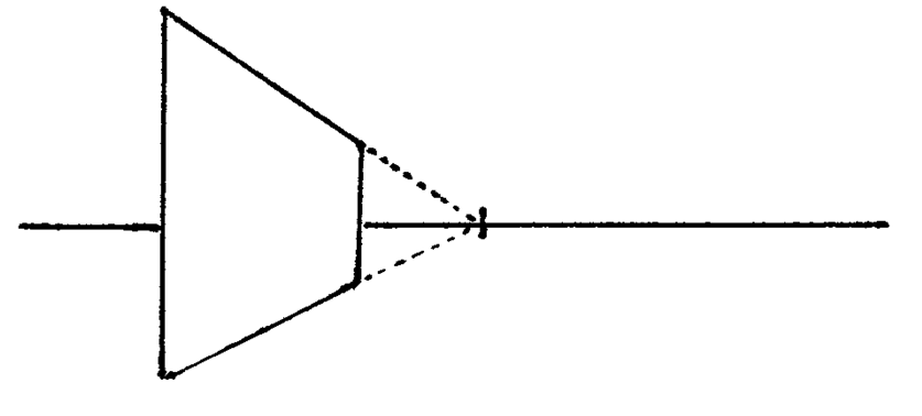
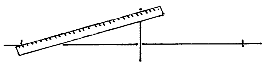
Determining angles for single-point perspective is easy.
-
Let's say this vertical line represents the edge of a fence. -
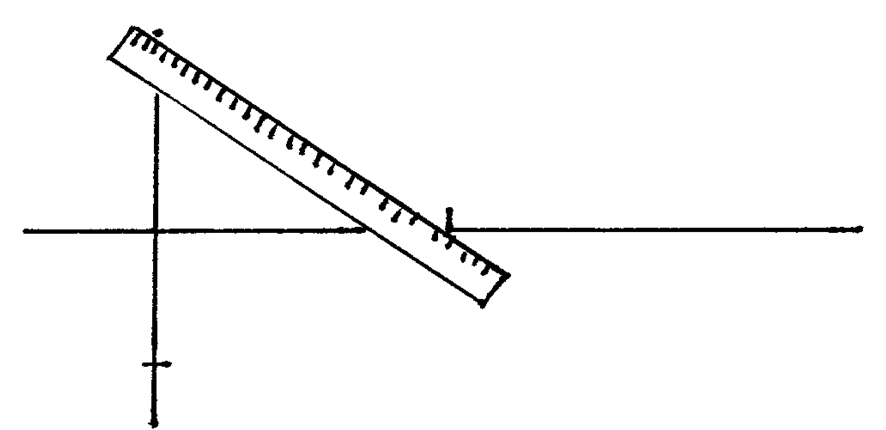
Align a ruler from the top of the fence to the vanishing point and trace the line. 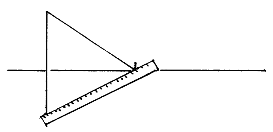
Again for the bottom. -
A fence! -
Of course, if we don't want an infinite fence, all we have to do is add another vertical and end it early. -
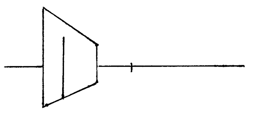
While we're at it, let's add a door to the fence. Draw a vertical line representing the height of the door. -
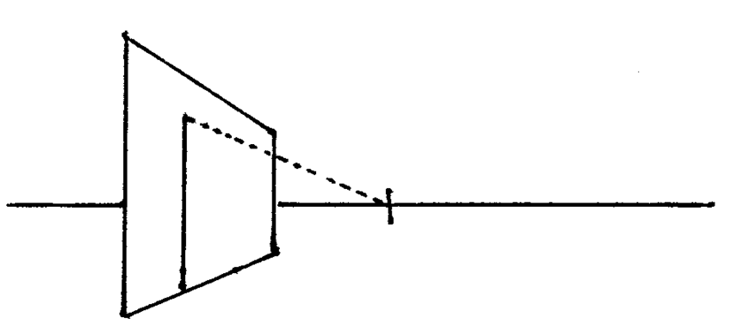
Find the line that goes from the top of this line to the vanishing point. -
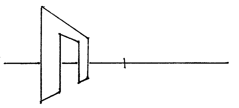
Add another vertical line and we've got a door!
Single-point perspective is nice because it's easy. It's incredibly simple to determine any angle using nothing but a ruler.
But don't think that just because it's simple that it's useless. In fact, I would argue that you should consider it your default—why overcomplicate things? In many cases single-point perspective is all you really need.
Single-point perspective: Examples
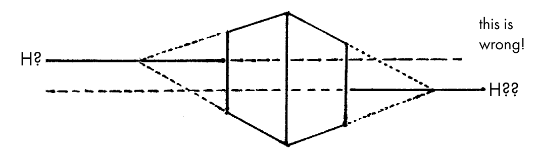
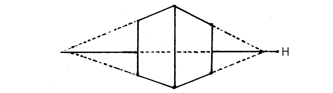
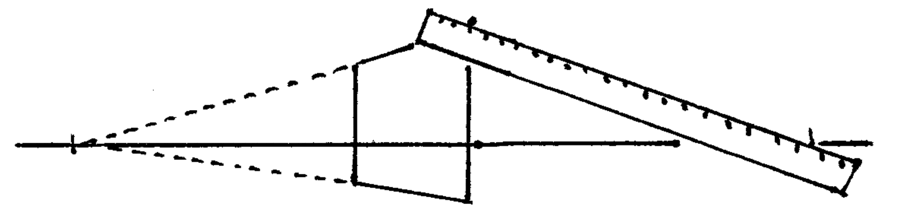
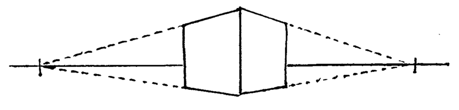
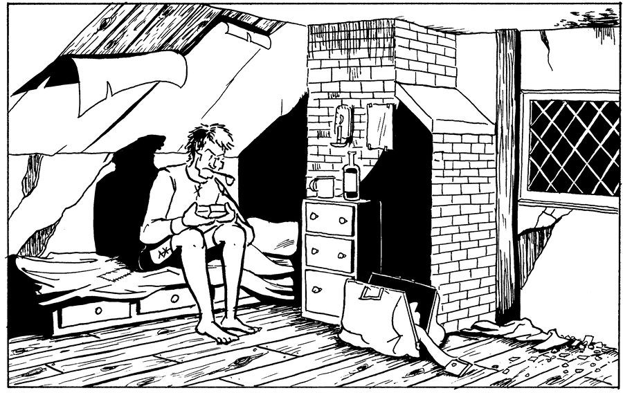
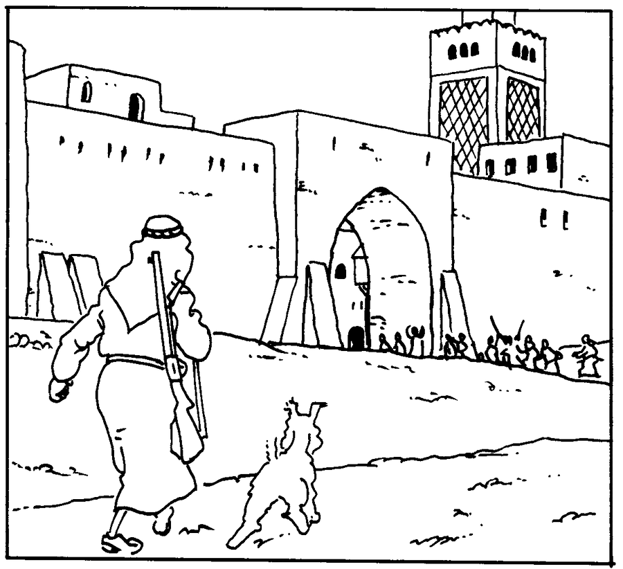
Two-Point Perspective

Two-point perspective works much like single-point perspective, but now both left-to-right axes converge.
Two-Point Perspective: Examples
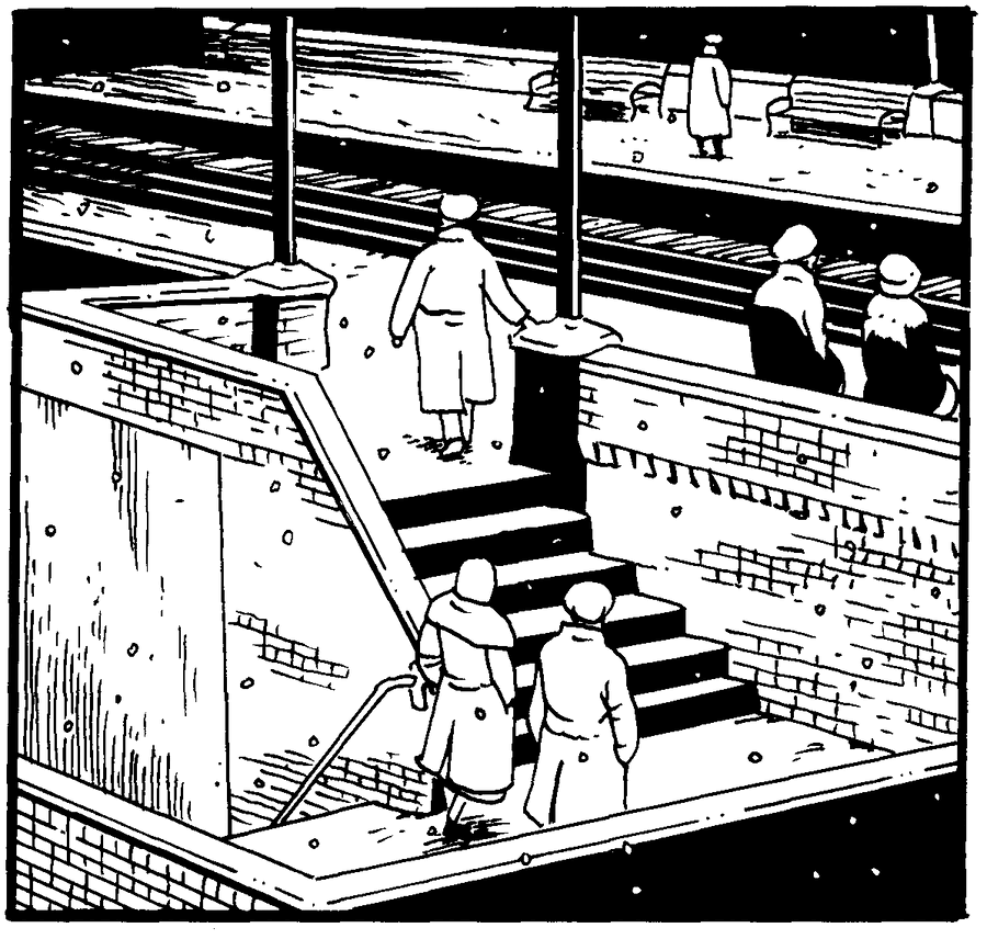
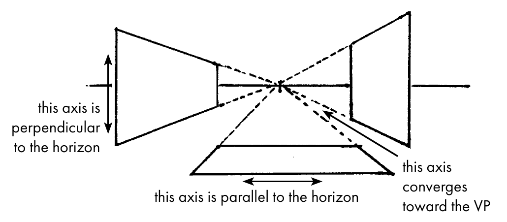
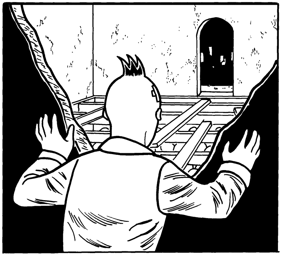
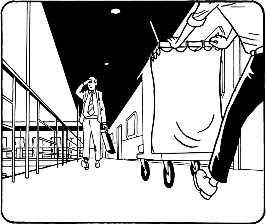
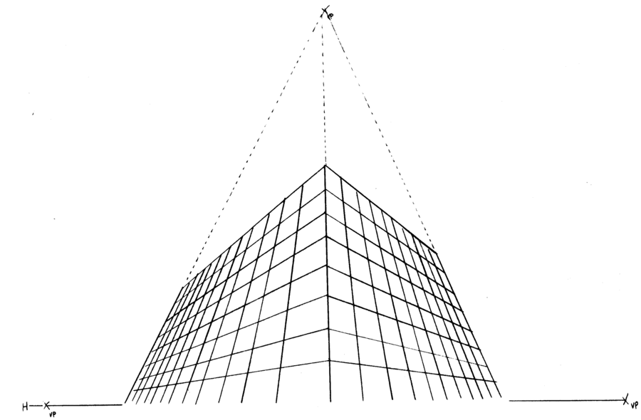
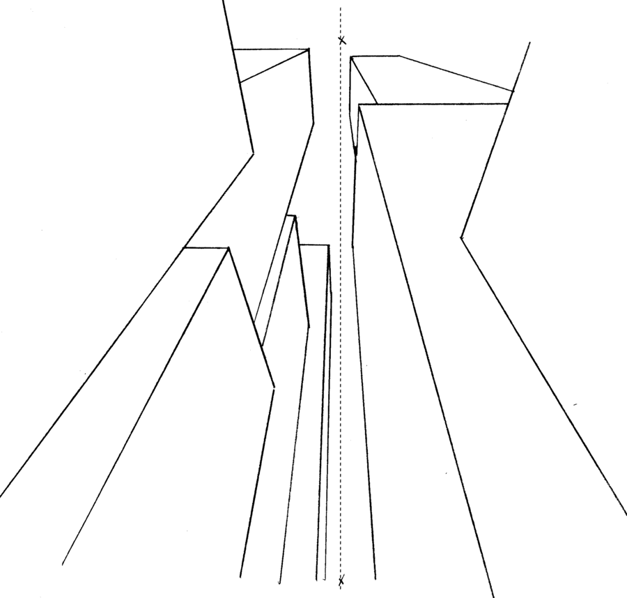
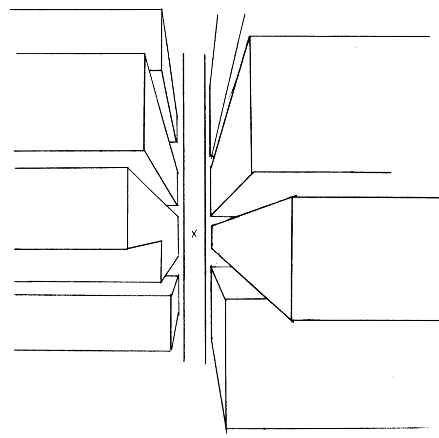
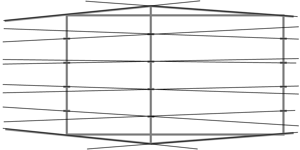
Three-Point Perspective
In three-point perspective, vertical lines are no longer perpendicular to the horizon. Instead, they converge toward a third point located either above or below the horizon. All three axes now converge!
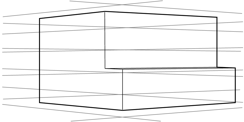
Three-point perspective is most useful when drawing a viewpoint that's looking upward or downward, especially when tall objects are involved.
But three-point perspective isn't your only option for drawing these kinds of views. Depending on the subject, you may be able to save yourself some trouble and use two-point or single-point to achieve similar effects:
Three-Point Perspective: Examples
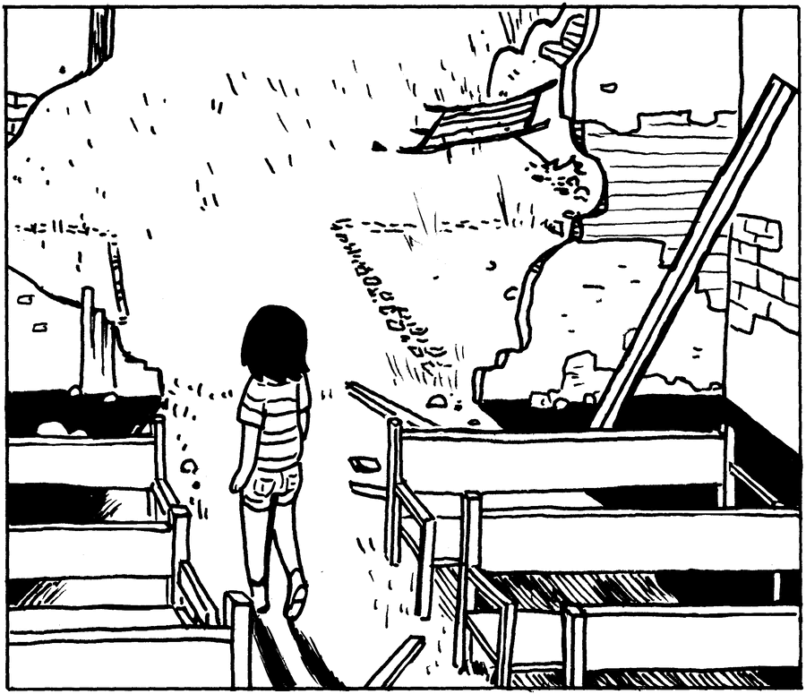
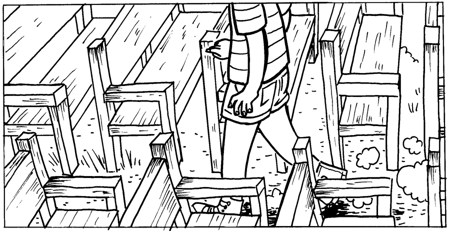
Here, Raina Telgemeier uses a "fake" three-point perspective. Lengthwise and heightwise the benches converge toward points on a vertical "horizon" but widthwise do not converge.
Ellipses
Ellipses are circles drawn in perspective. Drawing a good ellipse isn't easy, but the principles behind them are fairly simple.
-
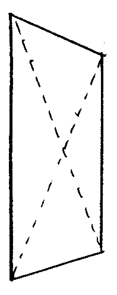
Begin with a square drawn in perspective, then add two diagonal guides to find its center. -
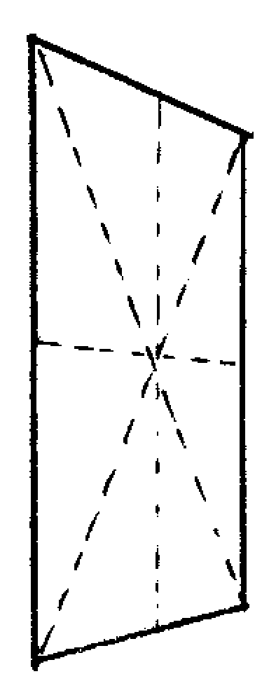
Draw vertical and horizontal guides through the center point. (Don't forget to align them with the corresponding vanishing points as needed!) The points where these lines meet the edge of the square will also be where the ellipse touches it. -
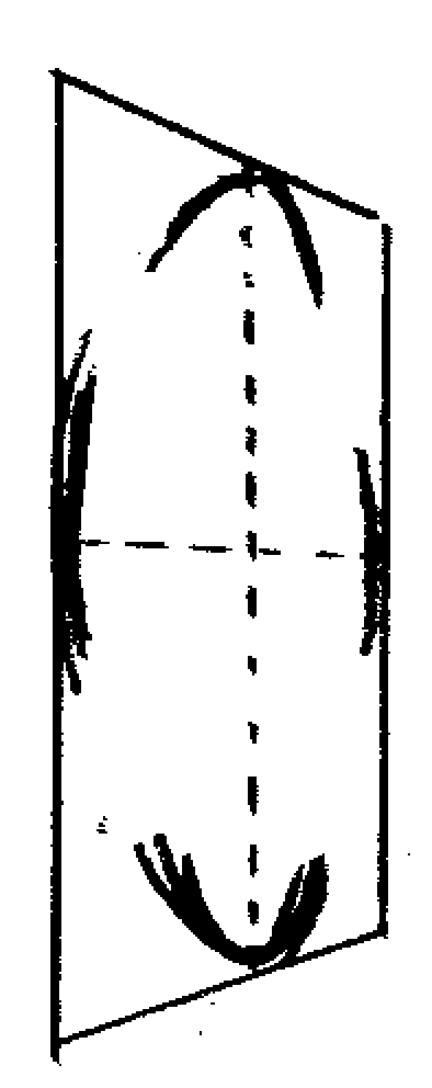
Begin sketching in the curves of the ellipse. It can be helpful to start from the guideline intersections and work from there, but it's not mandatory. -
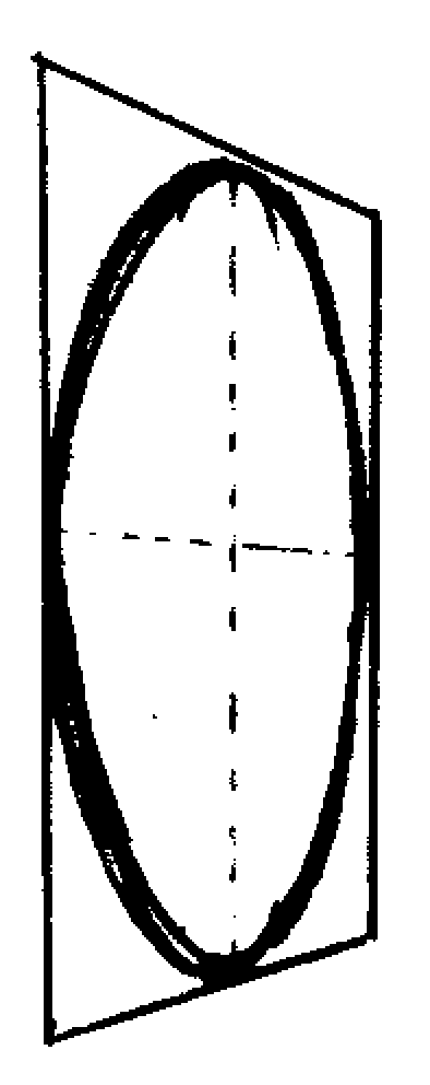
Continue sketching until you have filled out a consistent- looking curvature all around. Don't erase after mistakes, just add more marks until you have a sense of the correct form. -
Finally, do your best to freehand an ellipse that follows the curve you worked out. It can be useful to do the preparatory work on a separate sheet of paper and then transfer with tracing paper or a lightbox.
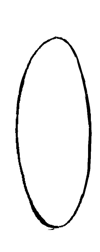
There's no way around it—drawing ellipses is hard. My advice: don't expect to get them right on the first try. Assume that you will have to experiment and clean up. If your process includes the computer, don't be shy about using digital ellipse tools if that's what it takes. You can also buy a set of plastic ellipse templates, but they're expensive.
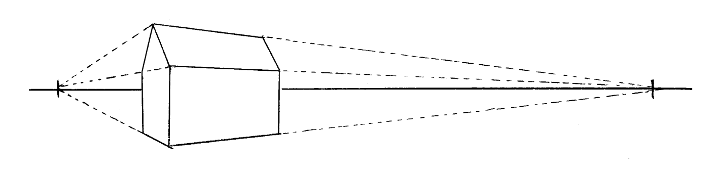
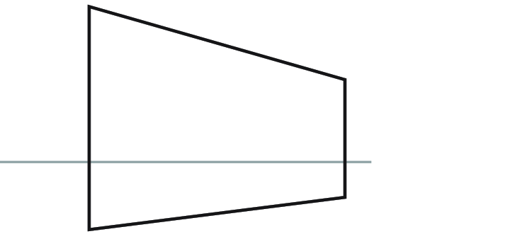
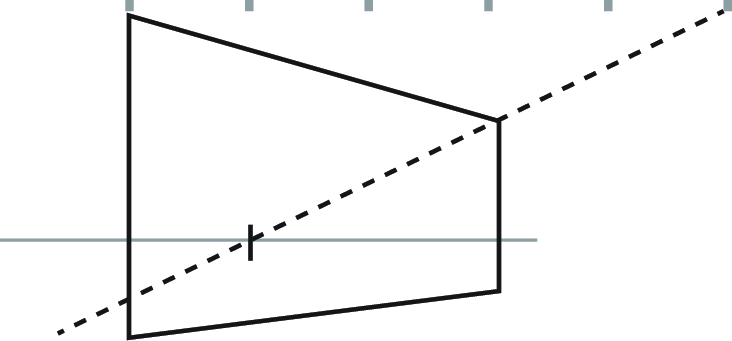
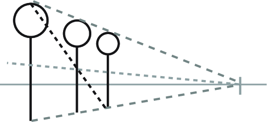
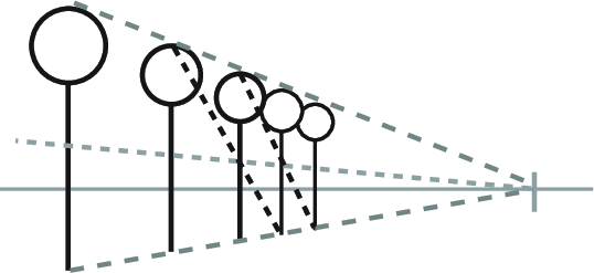
Placing Your Vanishing Points
The positioning of vanishing points relative to your scene affects how space is distorted in your drawing.
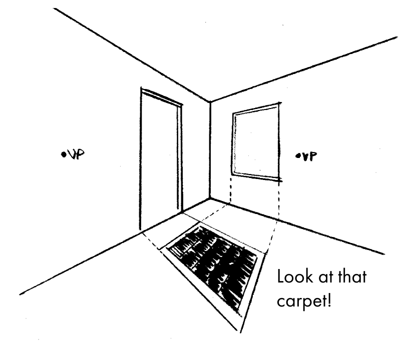
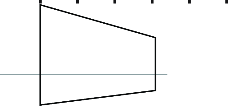
(Moving the right point, or both points, would have worked just as well)
Once you know how the positioning of a vanishing point affects distortion, you can use that knowledge to estimate the vanishing points from a rough sketch.
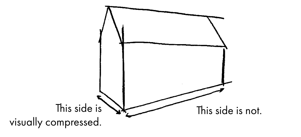
Just about right, but this also brings us to a recurring problem with multi-point perspective, namely:
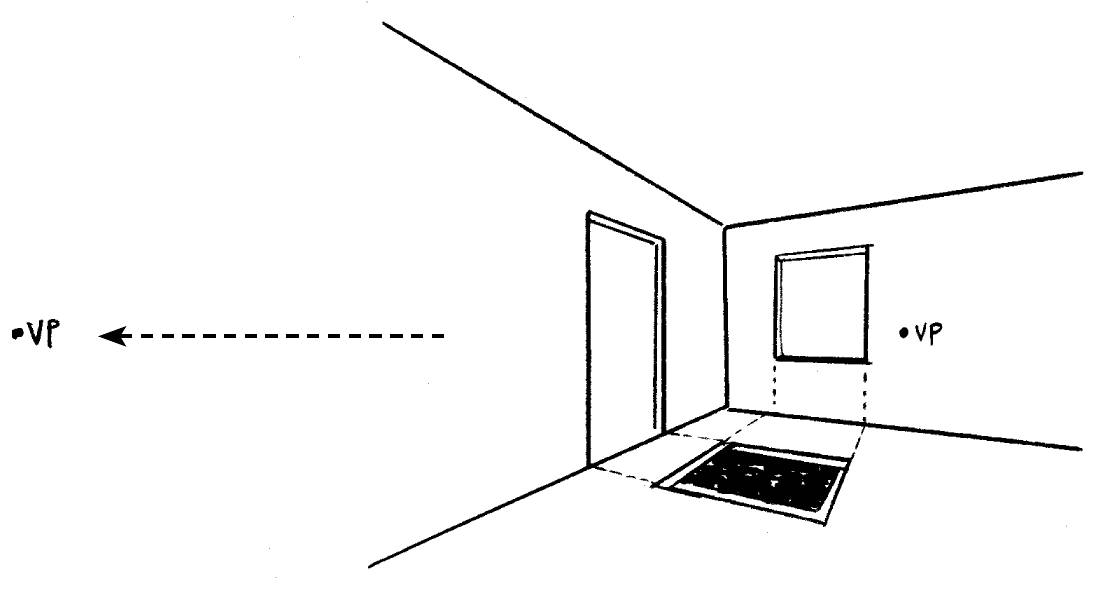
What To Do When Your Vanishing Point Is Beyond the Edge of the Page
This is perhaps the most frequent bugaboo of perspective drawing. Luckily there are a few ways to address it.
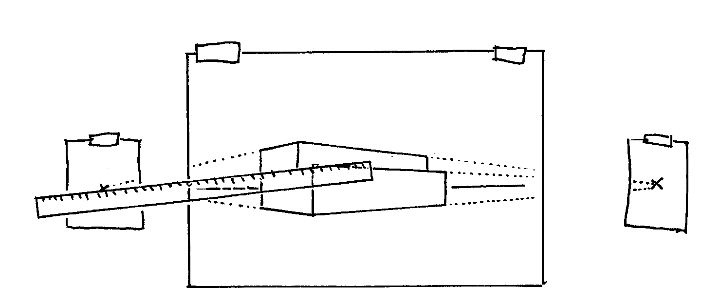
Another method is to make a study drawing at a smaller size, then enlarge it once you've figured out all the critical angles. You can use a copying machine for this (and I highly recommend having a good scanner-printer in your studio).
Alternatively, you could work with a perspective grid, as seen in the next section!
Creating a Perspective Grid
Another option for situations in which the vanishing point is off the page is to construct a perspective grid to use as a guide instead. I find using a perspective grid to be more difficult than aligning directly from a vanishing point, but some people like them and maybe you will too! This technique for constructing a grid is sometimes called the Brewer Method and was popularized in the book How to Draw by Scott Robertson with Thomas Bertling.
-
These three lines are the basis of our grid. You can adjust the angles of the lines as needed as long as the lines all converge toward a horizon. We don't know where that horizon is yet, but the two lines on the right converge somewhere. So the first step is to find the upper left line that will converge with the lower left line at the same horizon. -
Add a vertical line between the two right-hand lines. Place it as far as possible from the other vertical line.
-
Create a rectangle using this new vertical. The lower left corner of the rectangle is placed at the point where it intersects the lower left line. -
Now we know the correct angle for the upper left line –from the top of the vertical through the upper-left corner of the rectangle! Were you to extend the left and right lines, they would converge on the same horizon. -
Divide each vertical line into some number of equal segments. To do this you'll need to measure the lines and calculate the length of the subdivisions. I recommend using centimeters for this operation— much easier to measure out! -
Now draw lines from the division points on the left and right verticals through the corresponding divisions on the central vertical. You've got a perspective grid! If you want to add more lines to the grid, simply make more subdivisions and repeat.
It's not a bad idea to keep the grid on one sheet of paper and your drawing on another, using tracing paper or a lightbox. This way you won't have to erase the grid from your final drawing, plus you'll be able to also reuse grids and save time!
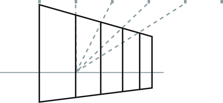
Dividing Space
This shows how to subdivide a given space into a specific number of sections of equal size. You can use this for the boards of a fence, banks of windows, or support beams under a roof.
-
Here is a wall. Let's say we want to divide it into five segments of equal size. -
First, create a series of equally-spaced points aligned with the upper corner of the geometry. To make five segments, we'll need six points. (Number of points = Number of segments + 1) -
Next, draw a line from the last point through the other end of the upper edge. Where this line meets the horizon, mark a new vanishing point. -
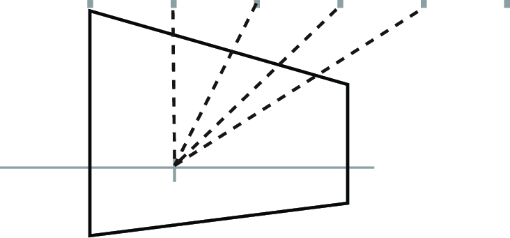
Draw lines connecting this new vanishing point to the other points of the guide. -
The points where these new lines intersect the upper edge are the perspective- adjusted positions for the divisions!
Multiplying Space
This shows how to repeat a unit of space an arbitrary number of times. You can use this for an array of equally-spaced objects, such as lampposts, telephone poles, or trees.
-
Here is a giant lollipop. Let's say we want to create a row of equally- spaced giant lollipops (and really, who doesn't?). -
Create guidelines running from the top and bottom of the lollipop toward the vanishing point. -
Choose the position for the next object in the series. Its position will determine the spacing for the rest of the series, so choose carefully! -
Find the center point between the objects by drawing an X between them, connecting the corners diagonally. -
Add a line that runs through the center point to the vanishing point. -
Draw a line from the top of the first lollipop through the intersection of the center line and the second lollipop. The third position is where this line meets the lower guide! -
To find the fourth position, draw a line from the top of the second through the center of the third. And so on to infinity!
What's the difference between these two techniques?
Dividing is useful when you need a specific number of points to be cover a specific space. For example, if you were to draw the side of a building and you want it to have a row of equally-sized windows, you would want to divide the length of the wall to find where the windows will go.
Multiplying is useful when you need to repeat an interval of space, but the exact length and number of repetitions doesn't matter. In our row of windows example above, multiplying would not be an ideal solution, because you would need to use trial and error to find the exact width needed to make the edge of the last window perfectly align with the far edge of the wall. However, if the far edge of the wall is beyond the edge of your composition, multiplication would probably be a better choice!
In short: Multiplication is easier but harder to control. Division is more complicated, but gives you more specificity. One method is not better than the other, but they have different applications. Start experimenting with them and you'll quickly understand when to use one or the other!
Orthographic Drawing
In orthographic drawings (also sometimes called paraline drawings), lines run parallel to each other and do not converge. In general, orthographic views use vertical lines for one axis, and specific diagonal angles for the other two axes.
The most common orthographic method is isometric, in which the two "side-to-side" axes are both set at 30° from the horizontal. Isometric artwork has been widely used to create an illusion of depth in non-3D video games.
To create an isometric grid:
-
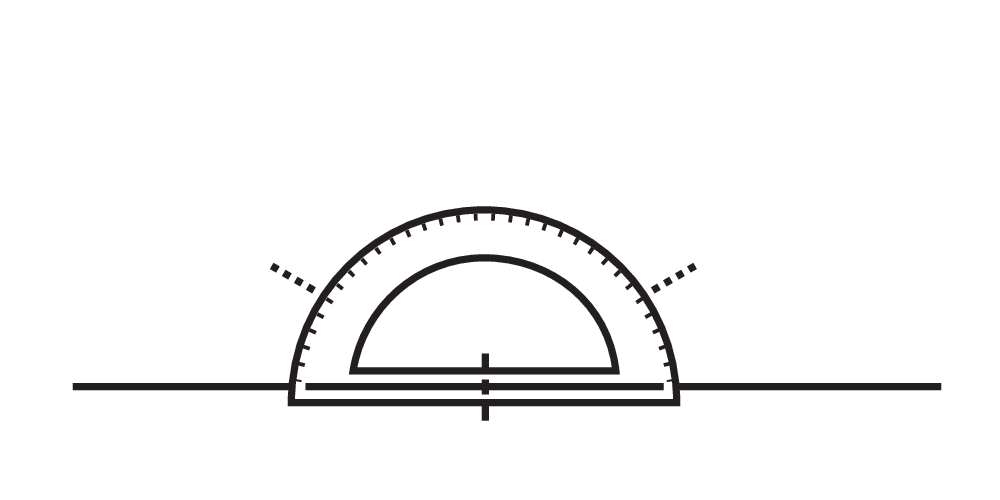
Draw a horizontal line and mark a point on it. Use a protractor to find 30° angles from this point. -
Draw the two diagonal lines that correspond to these marks. -
Now duplicate the lines at regular intervals. I recommend a transparent grid ruler, or rotating the paper and using a T-square.
Orthographic drawings have inherent clarity, which is why they are often used for diagrams and architectural plans. But this also makes them a good option for comics and illustration, where clarity is often more important than "realistic" perspective. Strangely, the technique is somewhat rare in comics, but it has a lot of potential. Try it!
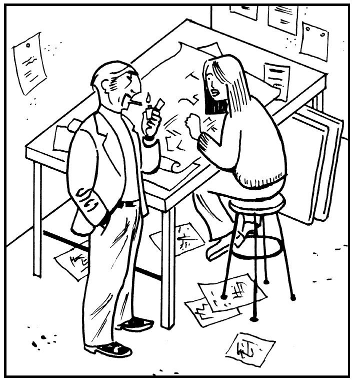
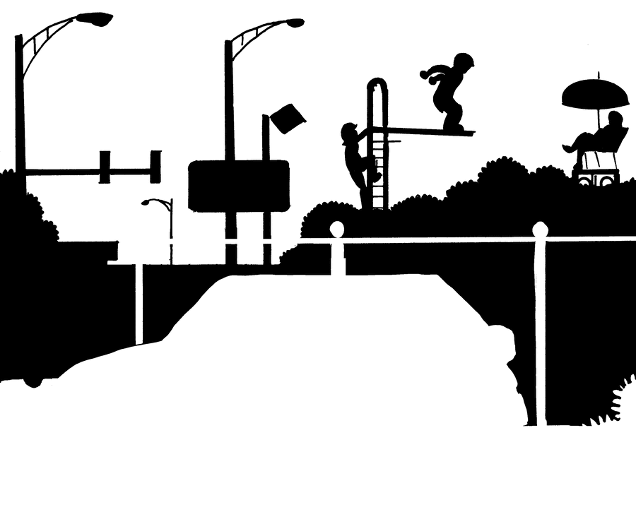
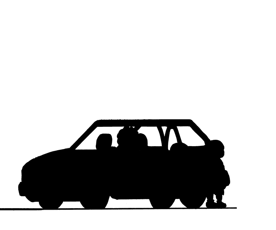
Faking It
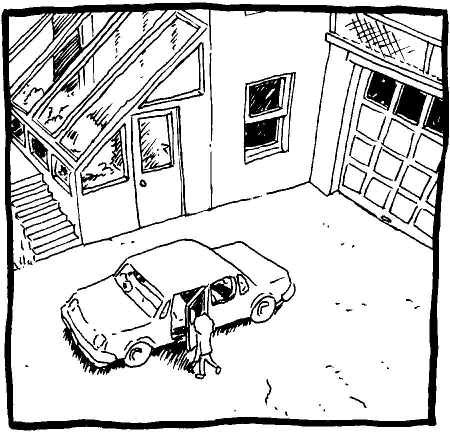
Sometimes perspective just isn't worth the trouble. I'd like to introduce you to an interesting approach to this that's frequently employed by comics artists. It doesn't have an official name that I'm aware of, but you might call it "flat perspective." This drawing by Chris Ware (master of the form) is a good example of this technique.
Objects in the distance are smaller, but they do not recede in a mathematically predictable way.
The orientation is an orthographic ¾ view, which suggests a bit more depth than a head-on view would.
Foreground objects are emphasized with a heavier line, and are closer to the bottom of the composition.
The characters and the car both sit on a horizontal "ground line."
Below the ground line is a space that represents the surface of the ground.
This method is fascinating because it makes no logical sense, but it does make sense intuitively. Placing characters' feet on a horizontal line "feels right," even though this scene could never exist in actual space. These kinds of drawings are easy to read, and easy for the artist to construct: a perfect match for comics art!
Two Last Things
Atmospheric Perspective
Air is not completely transparent. Even on a clear day, distant objects appear slightly faded. Atmospheric perspective uses this effect as another way to convey depth. Fading out the background also serves to diminish its visual significance, making it less likely to distract the reader.

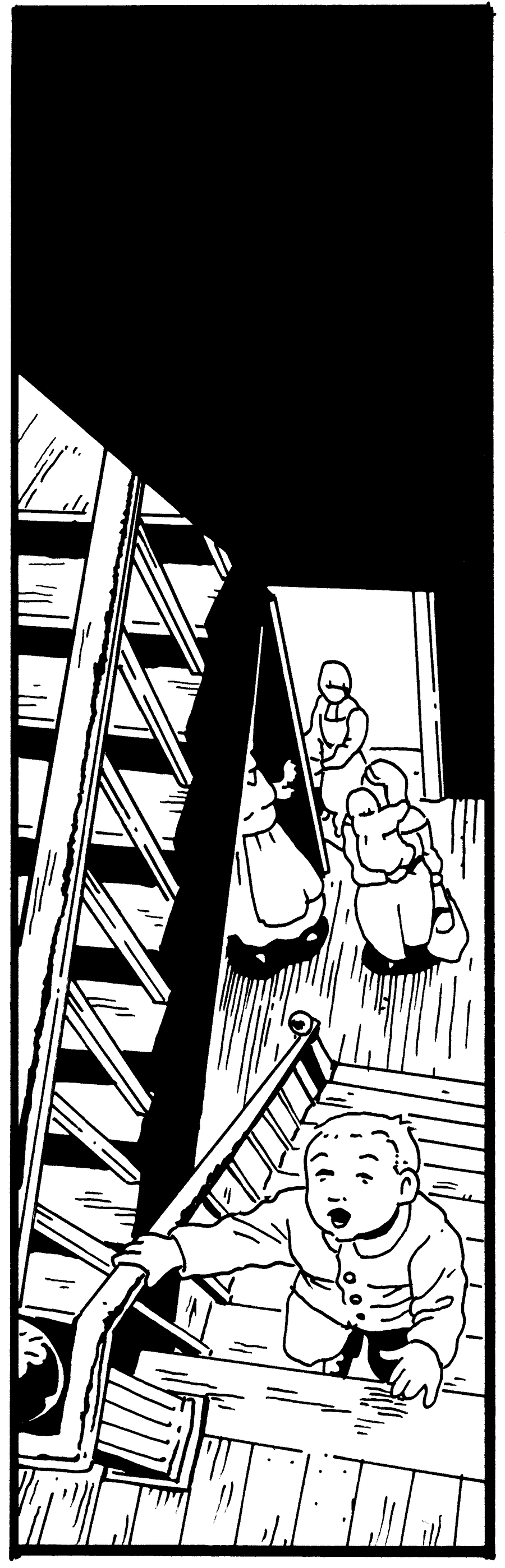
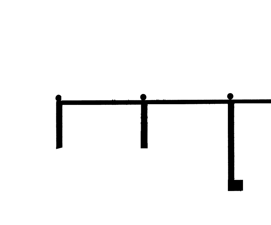
Layers of Depth
Consciously plan your compositions to have a foreground, middleground, and background. Multiple layers of depth always make a drawing more dynamic and interesting, and also offer some interesting possibilities for layout. Seen here is a breakdown of the Chris Ware drawing from the "Faking It" section into four layers. Notice how the car is framed in the image both by the bush in the layer in front of it and by the fence in the layer behind it. Consider adding another layer of depth to your next drawing—I think you'll like the result!

Exercises
- Design a very simple building and then draw it a few different ways. Move the vanishing points around, try three-point, rotate it, do an isometric view! Do your best to keep its features consistent.
- Use the same vanishing point layout to draw an interior scene and an exterior scene. Note the ways in which they feel different even though the parameters are the same.
- Draw a wall in perspective and then add a row of regularly- spaced windows. There are multiple ways to do this. See how many you can think of.
- Invent your own system for representing depth! This is all artificial anyway so anything is valid so long as it makes sense to the viewer.
- Make up a complicated scene and commit to getting the perspective right. Pretty broad for an exercise, I know, but the best way to get the hang of this stuff is to do it a lot.
Further Reading
- Design Drawing by Francis D. K. Ching with Steven P. Juroszek (Wiley, 2018). This is a textbook on architectural drawing. It is fairly technical but it contains a wealth of information.
- How to Draw by Scott Robertson with Thomas Bertling (Design Studio Press, 2013). An extremely dense and intimidating book, but I don't know of any better resource on how to construct complex objects in perspective. This is book was mentioned earlier as the source of the Brewer Method for perspective grids.
- Framed Ink by Marcos Mateu-Mestre(Design Studio Press, 2010). Once you've mastered perspective, this book can help you hone your composition skills to match!
- Perspective! for Comic Book Artists by David Chelsea (Watson-Guptill, 1997). I haven't read this book but a lot of people seem to like it, so it might be worth a look.
Indicia
Created in 2022 by Ivy Lynn Allie.
This content is not copyrighted. Please feel free to duplicate it, redistribute it, modify it, and spread the joys of perspective drawing wherever they are needed! (For non-commercial purposes.)
More specifically, this content is licensed under the Creative Commons Attribution- NonCommercial-ShareAlike 4.0 International (CC BY-NC-SA 4.0) license.
The exception to the above is the artwork examples, which are subject to the copyrights of their respective owners (see below). In the context of this booklet their inclusion is considered fair use, but reusing them in other contexts may not be! Use common sense and always credit the original artist. It's also worth noting that these images are traces, modified slightly for clarity and ease of reproduction.
Art Credits
Ivy Allie, "The Tinderbox", CC BY-NC-SA 4.0 2022; "Of Course, No One Knew", ©2020; Acting Out (forthcoming), ©2020. Chester Brown, I Never Liked You, ©1991-2002. Charles Burns, Last Look: X'ed Out, ©2010. Hergé, Cigars of the Pharaoh, ©1955 Casterman, Belgium. Jason Little, Motel Art Improvement Service, ©2010. Jason Lutes, Berlin: City of Stones, ©2004. David Mazzucchelli, Asterios Polyp, ©2009. Raina Telgemeier, Ghosts, ©2016. Chris Ware, The Acme Novelty Library, ©2005.